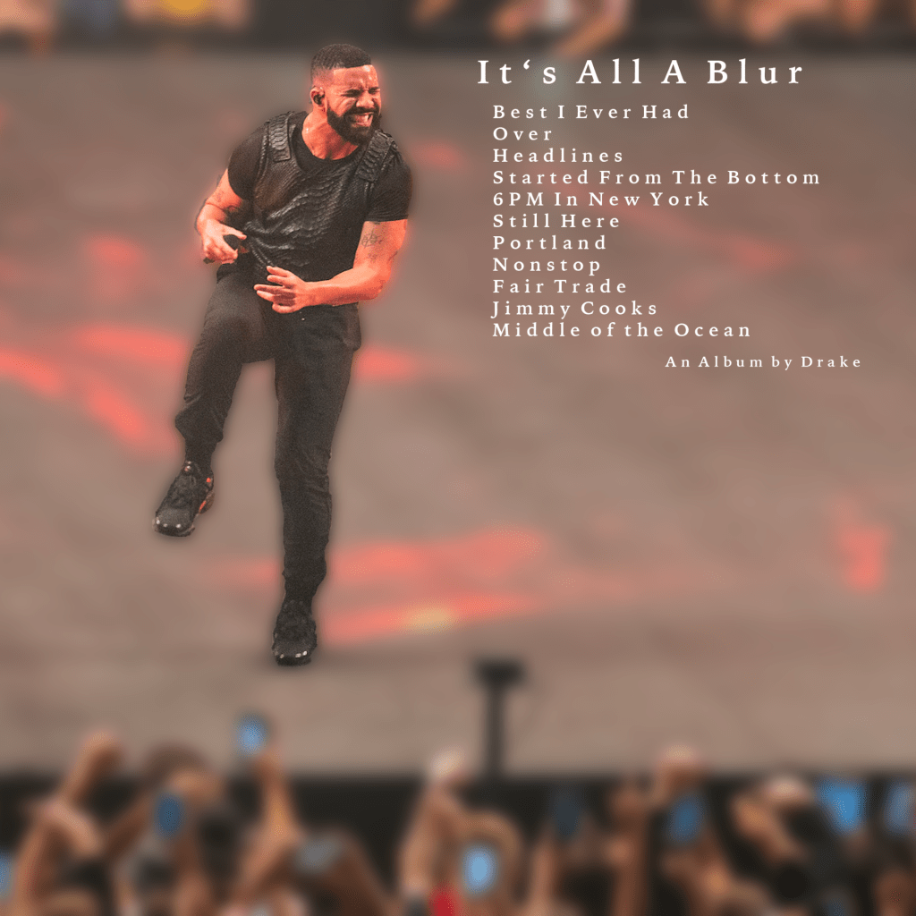
It’s All A Blur

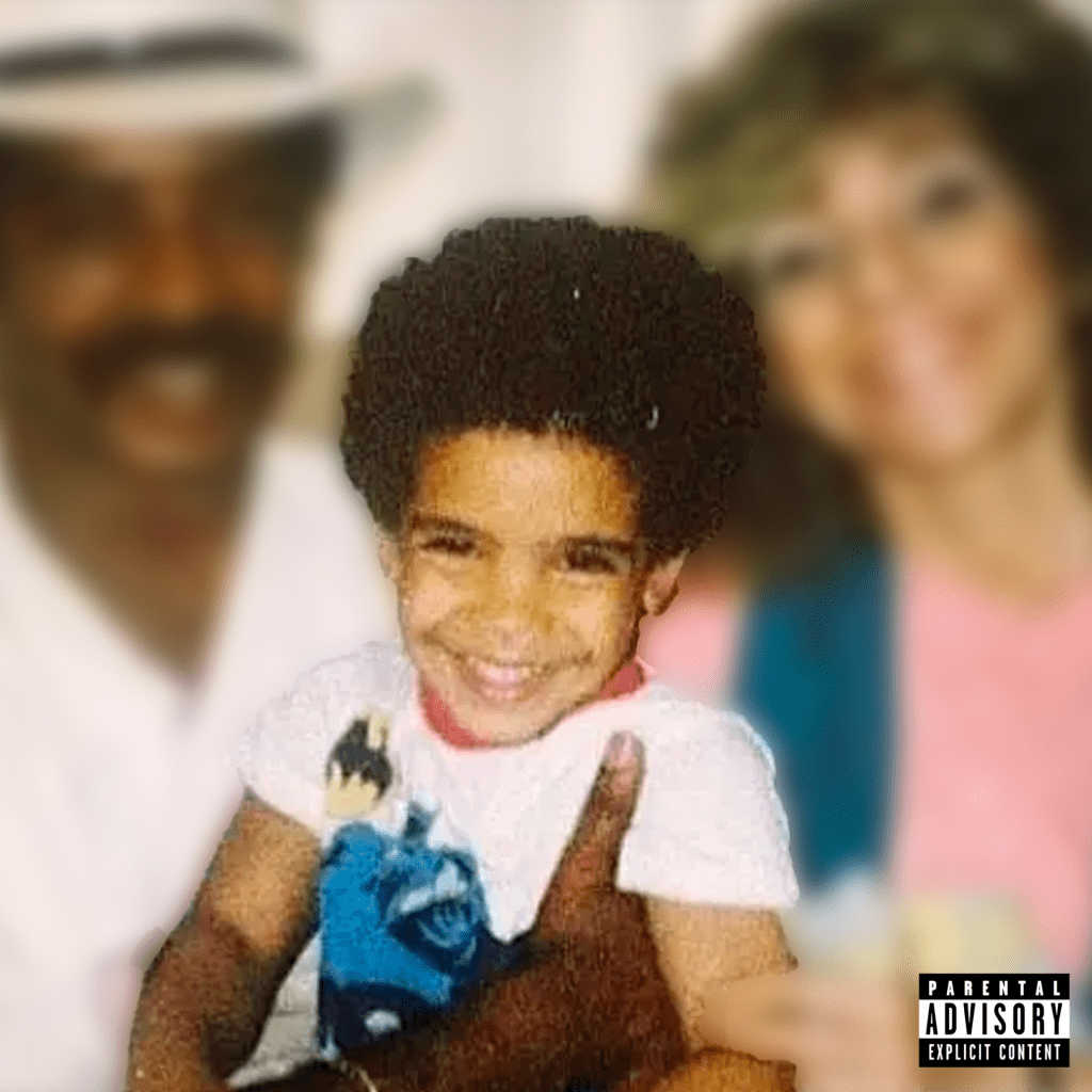
This is a Drake album. this album contains one song from each of Drake’s 11 famous albums from 2006-2022 in chronological order. I chose Drake because he is my favorite artist of all time and his life has changed so much since he was young. Hence why I named the album It’s All A Blur. Everything in Drake’s life kind of went by so quickly, from him being a young child playing basketball like any other kid in Toronto, Canada, to becoming one of the most streamed artists of all time.

I used Adobe Photoshop to create both the from and back of this album cover. Contrast and alignment were the two main principles that I used to create my album cover. I used contrast when it came to differentiating the blurred and non-blurred sections of the images. I purposely left Drake out of the blur to enhance how much everything has changed in his life. Alignment was used for the back of my album cover to separate the track list and the image of him performing on stage.

I want people to see the drastic changes that went on during Drake’s life. From him being a young child playing basketball like any other kid in Toronto, Canada, to becoming one of the most streamed artists of all time. I want people to understand Drake’s legacy and how important of an artist he is in this era. He is very motivational in his life stories. And my hope is to inspire the viewers that they can do whatever they want in life.

I really like both parts of my album because of the focus I put on Drake himself. I did this by using a blurring filter that went from a picture of his young self with his family, to a picture of him performing in front of thousands of his fans. Overall, I think that this album cover came out really well.
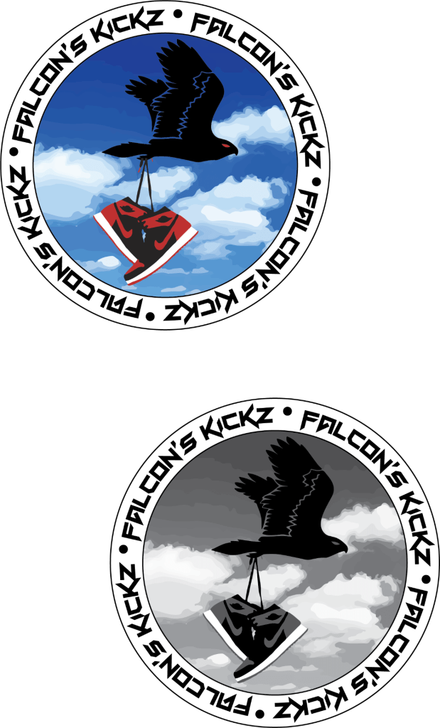
Falcon’s Kickz

The type of business that my logo was designed for is for a sneaker reselling company. The company would be based in NJ only. The company is made to buy, sell and trade popular valued sneakers. The logo represents my business because my last name is Falcon. The logo shows a falcon flying with a pair of popular Jordan 1’s. The target audience for my business is sneaker heads, or just people interested in buying popular Jordans, Yeezys and more. The logo appeals the target audience because it is bright and it shows a Jordan 1, that is a very popular shoe. I am proudest of the vector clouds in the background that contrast with the other images quite perfectly. Something I could have done better was make the falcon look like it was actually holding the shoes my the laces, rather than just overlapping them.

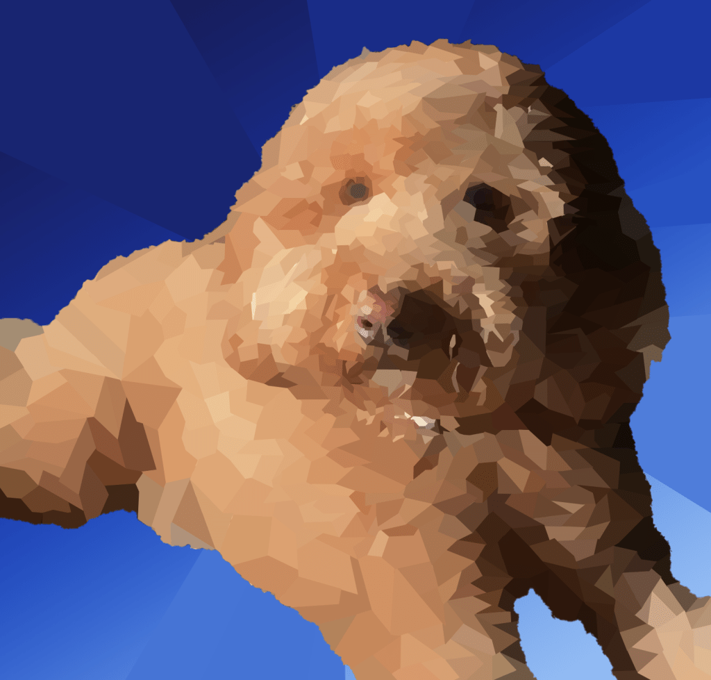
Geometric Dog

The subject of my illustration is of my own dog, Marley. She is a 2 year old Golden Doodle that we’ve had since she was eight weeks old. I chose this image because she was looking right at the camera and the lighting was originally really good. I liked this picture a lot, and I wanted to illustrate something that was relevant in my own life. Something I like about my art is how all of the low polygonal shapes start small around the face, and expand around the entire body. This took me a very long time, but in the end it was so worth it because of how detailed she looks. Some advice I would give another person before doing the low poly technique would be to prepare yourself to stay calm and relaxed while doing it. At some point, you might want to give up, but just keep pushing and it will come out great.


The King

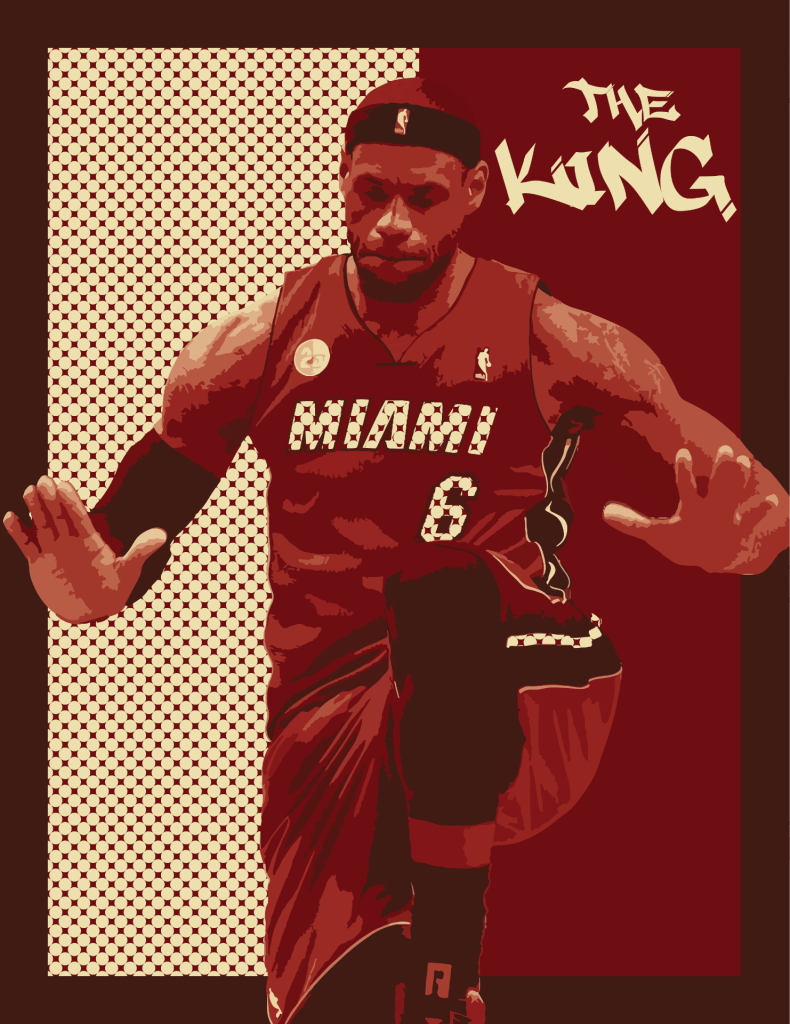
My artwork is an image of LeBron James doing his famous celebration where he stomps and beats his chest. LeBron James is known to be one of the greatest, if not the greatest basketball players of all time. He is very influential to the black community as being a main advocate for black history. My artwork is complied of the colors that LeBron wore when he played on the Miami Heat. I chose a polka dot theme that took up half of the background and also used the same print in the “Miami” and the “6” lettering in his jersey. The image is slightly rasterized, which I think leaves a really unique effect on his jersey and skin. In the top right, the wording says, “The King.” LeBron James’ nickname is King James because of his skill and longevity within the NBA. The media that I used to created this piece of art is called Adobe Illustrator.  I used many different tools and techniques to create my artwork. Such as, different selection tools and the grouping tool. I would say my favorite tool to use was the swatches tool because that was when my artwork all started to come together.

My artworks expresses lots of emotion, such as hype or motivation. When I see this, I see greatness and it being something that anyone can achieve when you set your dreams. Basketball is one of my favorite sports and LeBron is a big reason for that. So, this is here I got my inspiration from. My goals as an artist are to send a message to the viewer when they look at my art. As I said before, my artwork expresses motivation to the viewer, so it can give inspiration to other people looking at my art. Something I learned while creating my art is that you can use any colors for anything. I would have never expected to use the pattern that I did, but it ended up working out really nicely. This piece will further influence my other artworks because it taught me to expand my own art habits and use other unexpected techniques.

Say Cheese!

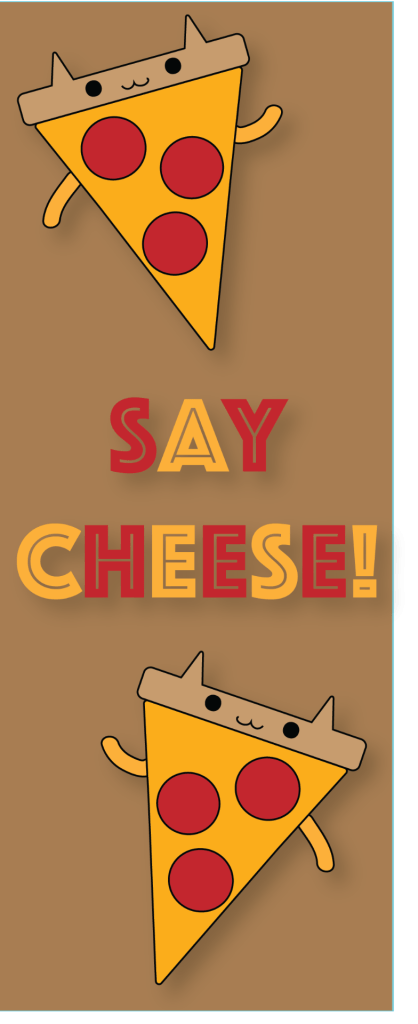
My “Say Cheese” piece of art is very vibrant in colors of the pizza. The background of the art is subtle, so that makes the positive message and the pizza pop out to the viewer. The media that I used for my artwork was Adobe Illustrator. I used all of the different shape tools in order to create my alive pizza. I also used the blob tool to create the face of my pizza. Although my artwork came together very nicely, it was a very tedious process.

What inspired my artwork was the cute food book that I was looking through in class. Before I chose the pizza image, I really like the simplicity of it, because I knew that I could turn it into something unique and inspiring. Also, what little kid doesn’t like pizza? So, as a kid, I would love to see this, as it would put a smile on my face, especially while reading, “Say Cheese.” This goes to show how this piece of art is aiming towards expressing a very happy and positive emotion.

My goals as an artist are to overall just inspire people to be happy within themselves. If people are able to achieve happiness through my artwork, I think it is successful. I know that this piece is going to make some child happy and better their life somehow. While making this artwork, I have learned that not everyone has it as easy as I do. And if I can create something that can better their life, that makes me happy because that is the overall goal. This is definitely not what I expected the outcome to be because I had chose many other images to illustrate. But, when I saw the pizza, I knew I could turn it into something amazing. This art will influence my later artwork because I enjoy developing positive messages.

Yogi Falcon

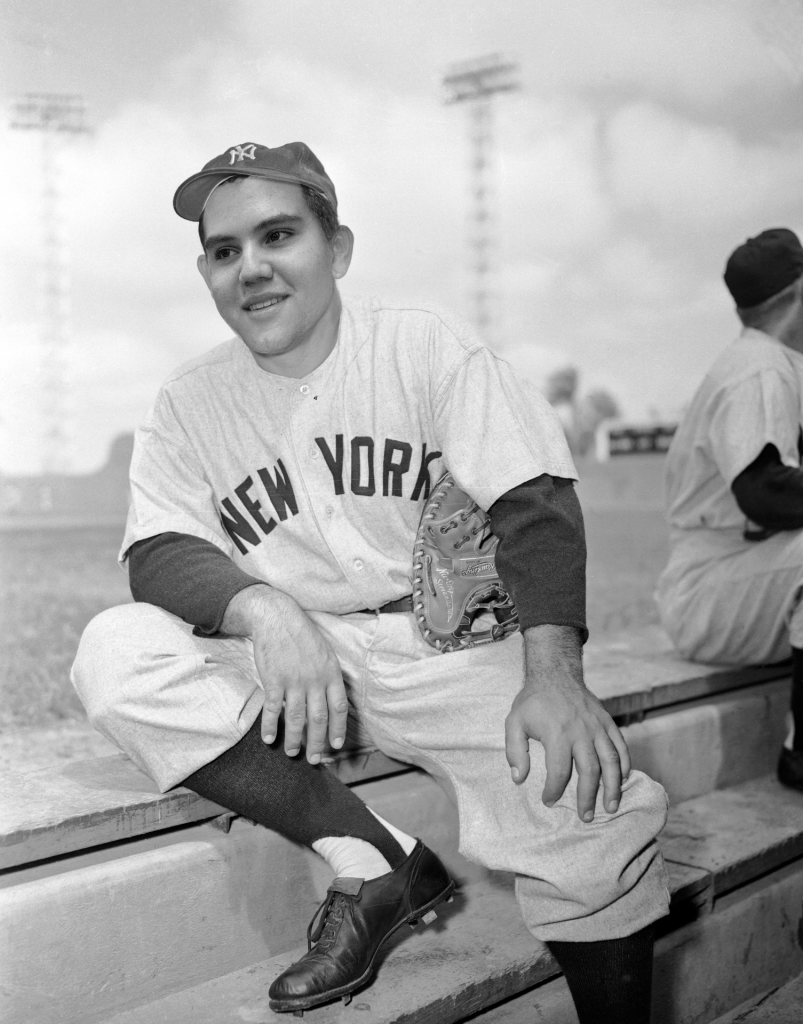
While doing this project, I got to understand my true love for baseball and the New York Yankees. Yogi Berra is one of the greatest catchers of all time and known for his kindness acts throughout his career. I can relate to Yogi Berra because not only is he one of my favorite players ever, but I am also a catcher and a humble person, similar to Berra. I have always aspired to be the kind of person Yogi was, before he passed away. My advice to someone else doing this project would be to choose someone who had an impact with something they did and somehow relate it to your personal life. Doing that made this project much more enjoyable.

Brotherly Portraits

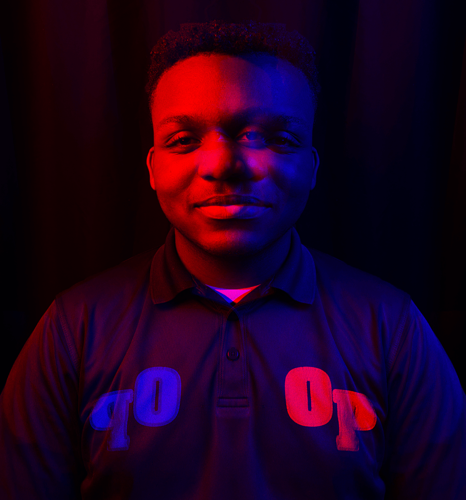
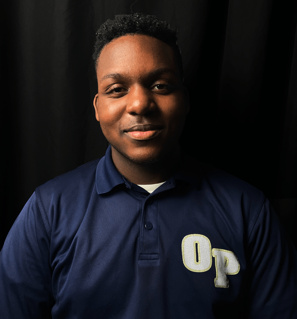
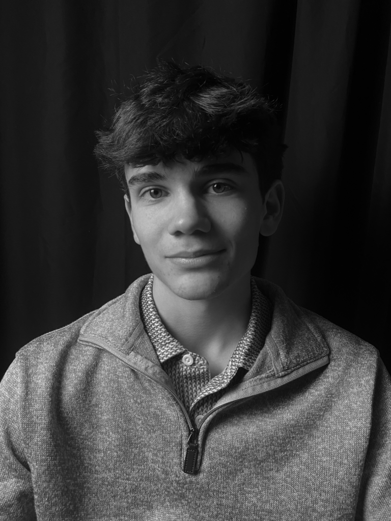
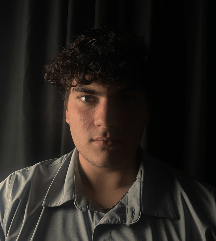
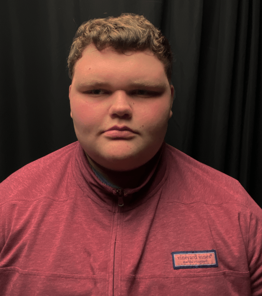
While taking these photos, I had to be extremely precise in where I would put the light. The slightest movement of the light can genuinely change the photo completely. Especially in regards to rembrandt lighting versus loop lighting. There is such a slight, but major difference between these two. I really enjoyed taking these phots because it showed me the great capabilities of the iPhone camera and that good photography does not always have to be used by a digital camera lens. Overall, the lighting of an image can truly change the perspective of it. You can get so many different moods just by changing the lighting.

MoKendrick LaLisa

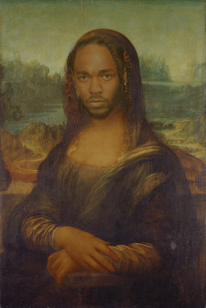
For my Cretu, I used Kendrick Lamar’s face on the Mona Lisa.  In 2018, Lil Wayne released his album called “The Carter V.” On that album, there was a song called “Mona Lisa” featuring Kendrick Lamar. This was one of the better songs on the album. Although “Mona Lisa” was not produced by Kendrick Lamar himself, he had great significance in the song. When doing this Cretu, I spent lots of tedious time blending the two flesh tones together. However, what made it all come together nicely was definitely the texture that I placed over the whole image. I enjoyed making this Cretu because it was a unique way of putting together something that had relevance to each other.

A Taste of my Palate

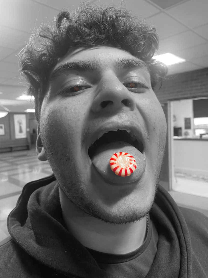
This photo was taken in the Bain Lobby.
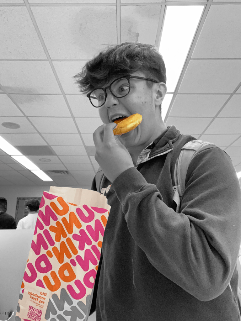
This photo was taken in the Mac Lab in Bain.

When taking photos of food, there are many things that go into making it really good. You should use food like how you use nature. Meaning that you should not just use the food as a prop for the picture and make it look forced. Having your image look like it has a different purpose than just a prop, makes it have a different feeling when you look at it. It makes you feel what the person feels when eating the food.