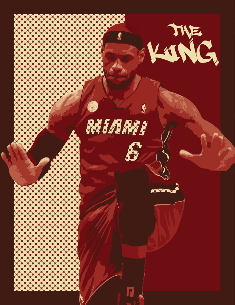
My artwork is an image of LeBron James doing his famous celebration where he stomps and beats his chest. LeBron James is known to be one of the greatest, if not the greatest basketball players of all time. He is very influential to the black community as being a main advocate for black history. My artwork is complied of the colors that LeBron wore when he played on the Miami Heat. I chose a polka dot theme that took up half of the background and also used the same print in the “Miami” and the “6” lettering in his jersey. The image is slightly rasterized, which I think leaves a really unique effect on his jersey and skin. In the top right, the wording says, “The King.” LeBron James’ nickname is King James because of his skill and longevity within the NBA. The media that I used to created this piece of art is called Adobe Illustrator. I used many different tools and techniques to create my artwork. Such as, different selection tools and the grouping tool. I would say my favorite tool to use was the swatches tool because that was when my artwork all started to come together.
My artworks expresses lots of emotion, such as hype or motivation. When I see this, I see greatness and it being something that anyone can achieve when you set your dreams. Basketball is one of my favorite sports and LeBron is a big reason for that. So, this is here I got my inspiration from. My goals as an artist are to send a message to the viewer when they look at my art. As I said before, my artwork expresses motivation to the viewer, so it can give inspiration to other people looking at my art. Something I learned while creating my art is that you can use any colors for anything. I would have never expected to use the pattern that I did, but it ended up working out really nicely. This piece will further influence my other artworks because it taught me to expand my own art habits and use other unexpected techniques.
The subject in the poster is Lebron James. Lebron James is a great basketball player. He is very motivating in that anyone can be great at what they do. I love the repetition in the letters in the jersey. I think I would change it to make Lebron James a little smaller so he fits in the border.
Lebron is one of the greatest basketball players of all time, and his philanthropy and grit have made him an example for young men across America. Noah’s use of contrast, alignment, and repetition help to bring the image of Lebron to life and add depth to it. The polka dots make it so the image is really complete. The colors work well together, and they are also significant to Lebron’s character. You could maybe add a bit more blend of colors, but this is almost perfect in my eyes.
The subject is an image of Lebron James. He is regarded as one of the greatest NBA players of all time. He is influential to the black community and is an advocate for black history month. Noah used contrast with the colors in Lebron’s jersey and the background, including repetition with the left background with alternating colors. He used proximity to separate the colors on the jersey to make it more visible. The colors enhance the subject because it makes it seem real since Lebron’s Miami Jersey in real life has the exact same colors. The colors also work well with the background since they make Lebron look noticeable and that there is good contrast between Lebron and the background. Advice I would give to improve is to not make the word “Miami” and number 6 the same design as the background so it doesn’t look like the left background is crossing the middle.
Noah chose Lebron James and he is one of the best players in NBA history. He also does a lot of work in his community trying to create the same opportunity he was given for kids. Noah did a great job of using proximity and contrast to make the image pop from the background. He made sure to center the image. The colors he chose not only work extremely well together but also relate to Lebron. The only piece of advice I have is to maybe use a font that is easier to read.
Noah is using Lebron James for his Black History Month Poster, who is renowned as one of the best if not the best players in the NBA. He is a philanthropist who acts as a guiding beacon for those trying to get into sports. Noah uses repetition of the background in order to help make Lebron pop off the background. In addition, this pattern is used to help make the text of “Miami” and “6,” with a small other part using this format as well. The contrast of the red with the background pattern is what causes the work to really pop as a whole. The alignment is good as well, as the text “The King” starts off powerful. The proximity of Lebron to the bottom of the page helps add to the jumping motion that he has, as if he is jumping into frame. The colors are really nice, with the dark red helping to balance out the light tan color. I particularly like how the left side which is tan still uses the dark red within it. The darker border also helps make everything else stand out even more. The only thing that I can mention is that the color around Lebron’s head in the red section is a little difficult to look at and at certain points it merges with the background, losing its defining shape.
Lebron James is one of the best basketball players to ever play the game of basketball and the contribution that he has made to the game of basketball is impeccable. He is the best player to ever play the game and he contributed to much of the black culture with his skills in the terms of basketball. The picture of Lebron James has great repetition of the design he used on the left side and the red also matches with the team he played for which is the Miami Heat at the time. These colors match the background very well and the scene that is depicted is one of his most iconic scenes in basketball. I would give no advice because its almost perfect but the only thing I can see is his eyes are closed which is not a problem but I would like to see his eyes.
The subject of this poster is Lebron James who is one of the top 2 greatest basketball players of all-time. He is a big advocate for the BLM movement. This poster does a good job of all of the aspects of CRAP. The repetition is seen especially in the pattern on the left side of the poster. The colors contrast very well and they are significant as they are the colors of the Cleveland Cavaliers, the team that drafted Lebron and that he won a championship with. I think that this poster is really good and it is hard to find something to fix, but if I had to I would move the words up and to the left a little bit.
Who is the subject and what legacy of excellence have they contributed to Black History?
– The subject of this poster is LeBron James, who is the greatest basketball player of all time. He is also a voter rights and prison reform activist.
(CRAP) Explain specifically how the designer used (or did not use) contrast, repetition, alignment, and proximity in their design.
– I think the repetition of the patten used was well done. I like the alignment of the subject because he is center. The proximity I like how there is no negative space in this piece.
Do the COLORS chosen for the subject enhance the figure and work well with the background? Explain why yes or no, and be specific.
– Yes because they are the color of the Heat which is one of the teams LeBron played for.
What advice would you give the artist to improve their work? Explain. (Do not say “nothing”, everyone’s work can be improved, be specific)
– I would’ve put a pattern on his headband.
The subject of the artwork is Lebron James, often regarded along with Michael Jordan as the greatest basketball player of all time. He is living proof that anybody can do something amazing, even a small kid from Akron, Ohio, so he is a crucial part of black history.
I think the contrast works very well, as the lighter beige complements the darker reds and maroons. Repetition was exemplified by repeated circles in part of the background and in the details of Lebron’s jersey, and instead of simple lines, this feature adds a bit of extravagance to the overall artwork. The alignment also works, as Lebron is front and center and the words “the king” are pictured in the top-right corner over his left shoulder. However, the only issue with the proximity is that the words “the king” are very close to Lebron’s ear, so some space between the two would benefit.
This may be my favorite color combination out of all the posters. I love the red/maroon-on-beige combination (I used it in my own artwork, after all) and I think the colors simply complement each other extremely well. Nothing blends in with something else and it is just an overall beautiful color palette.
The only advice I would give is to balance out the clean up the right edge a little bit. Lebron’s elbow gets a little bit cut off from the border, but besides that, there is not much else to improve on.
Noah’s subject of his poster is LeBron James, considered one of if not the greatest basketball in history. Lebron has dedicated his life to inspiring the youth and giving back to the community that gave him life. His creation of foundations, shelters, schools, and children camps serve as a piece of hope for those in impoverished areas while continuing to break records on the court.
Noah uses contrast with the colors of Lebron’s jersey and the background makes LeBron pop out. He uses the repetition of colors throughout the poster to make everything feel even. The alignment of LeBron is well done. I especially like how his hands go over the border, making him feel three dimensional. And more realistic.
Noah’s color choice does enhance the image as he uses the real colors of the Miami Heat jersey, making it more realistic and easy on the eye. The background colors are not overbearing, keeping LeBron as the subject while still helping LeBron pop.
The only advice I could offer would be to possibly blend the colors more. There are some spots that don’t perfectly blend, but the poster is still really good.
The subject in the poster is Lebron James. He is regarded as the best basketball player of all time.The contrast is used perfectly here . The contrast on the Jersey and its body is used beautifully. The repetition of the polka dots is perfect here. The Alignment of everything here is centered really well. The Proximity of the words and Lebron is spaced out really well. The colors chosen are perfect using the Miami Heat as the color way. I think he could improve on it by adding another color into the image.
The subject of this poster is Lebron James, who is considered to be one of the best basketball players ever. Lebron has dedicated his life to inspiring people and giving back to his community. The creation of his foundations, schools, and camps for children. They serve as a place for people in impoverished areas, while still being one of the greatest basketball players ever.
Noah uses repetition of colors throughout the poster to tie everything together. He also uses contrast witht the background and the color of Lebron’s Jersey to make him popout.